Power BI
During the lab, we get acquainted with a new tool called Microsoft Power BI. We will start working together, then some of the exercises will be individual work. You shall submit the solution to all exercises.
Prerequisites, preparation
Tools needed to perform the lab:
- Windows
- Power BI Desktop
- GitHub account and a git client
- Microsoft365 account (***@edu.bme.hu)
Auxiliary materials and preparation materials that can be used to perform the laboratory:
- Power BI platform: documentation
Preparation
Keep in mind that you are expected to follow the submission process.
Create and check out your Git repository
-
Create your git repository using the invitation link in Moodle. Each lab has a different URL; make sure to use the right one!
-
Wait for the repository creation to complete, then check out the repository.
Password in the labs
If you are not asked for credentials to log in to GitHub in university computer laboratories when checking out the repository, the operation may fail. This is likely due to the machine using someone else's GitHub credentials. Delete these credentials first (see here), then retry the checkout.
-
Create a new branch with the name
solutionand work on this branch. -
Open the checked-out folder and type your Neptun code into the
neptun.txtfile. There should be a single line with the 6 characters of your Neptun code and nothing else in this file.
Free Power BI registration
-
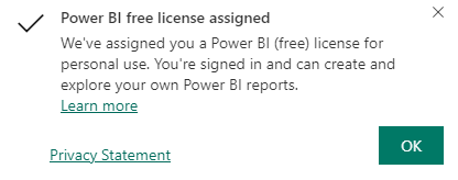
We will use the free subscription level of Power BI. Use of this is subject to pre-registration. Please visit Power BI's homepage login with your ***@edu.bme.hu email address and click on the free registration button. Upon successful registration, you will receive the following message:
-
Registration takes us to Power BI's Website. Let's try it out.
Install PowerBI Desktop
We will use the Power BI Desktop application to create Power BI reports. It is pre-installed on lab machines, it probably needs to be installed on your own device.
-
Make sure that you have the Power BI Desktop app installed on your computer, and if you do, you don't need to follow the steps below.
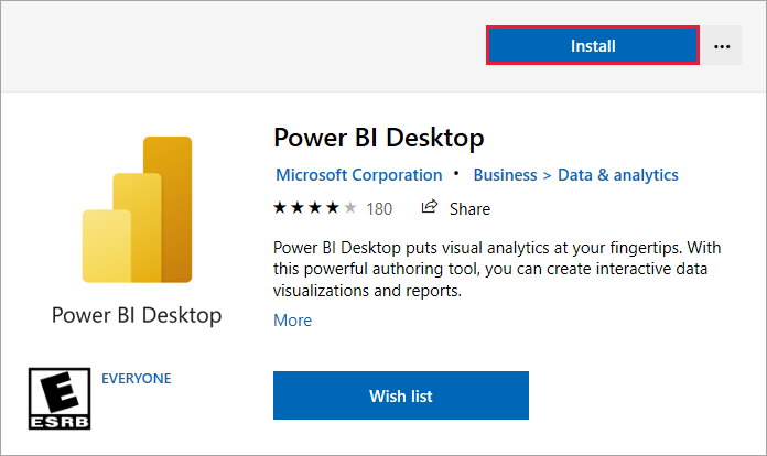
Power BI Desktop is the most convenient to install from the Microsoft Store. This is also practical in laboratory machines because it does not require administrative privileges. You can also choose the downloadable installer for your machine.
-
Open Power Bi Desktop App in the Microsoft Store and choose installation! You do not need to log in to the Store to do the installation.
1. Task: Spreadsheet Report (5p)
This exercise is solved together with the lab instructor.
Generating Power BI reports usually follows a typical workflow with the following steps:
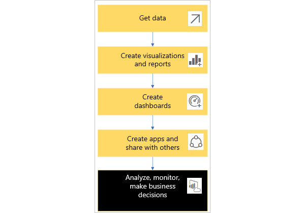
In the process, we will use the Power BI Desktop application to design the reports, while publishing and sharing the reports will be done with Power BI Service.
Create the first dataset
In Power BI, we can import data from about 150 different data sources, either for a single load or for continuous queries over a live connection. For the sake of simplicity, the data to be processed in this lab will be obtained from a version of the relational database exported to Excel, which will be registered in the next steps.
-
Download the database fromAdventureWorksSales.xlsx. Open the file, get acquainted with the data in it!
-
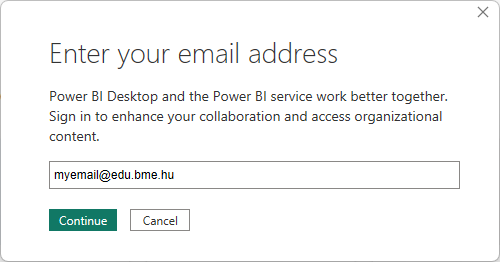
Launch the Power BI desktop application. Log in with your own ***@edu.bme.hu user.
Hint
Power BI Desktop can be used without logging in, but publishing will require a logged in account. If you work on a shared (lab) computer, don't forget to log out at the end of the lab!
-
Close the pop-up dialogs and save the project (File/Save) in any directory.Project name should be your Neptun code!
Hint
Everything we do in Power BI Desktop will go into this project file (NEPTUN.pbix). The project file must also be submitted together with screenshots of the solution.
-
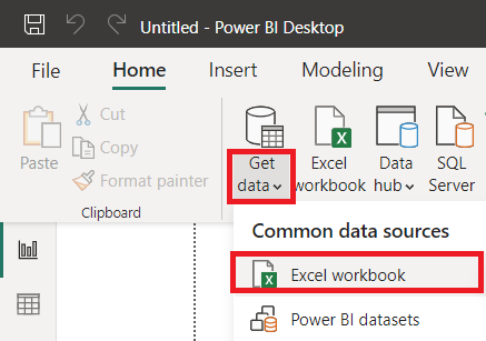
Load the previously downloaded AdventureWorksSales.xlsx file. (Get data /Excel workbook)
-
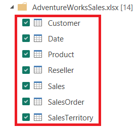
Select all the data tables (no data postfix in the name) and press the Load button.
-
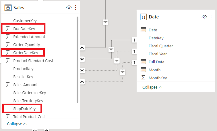
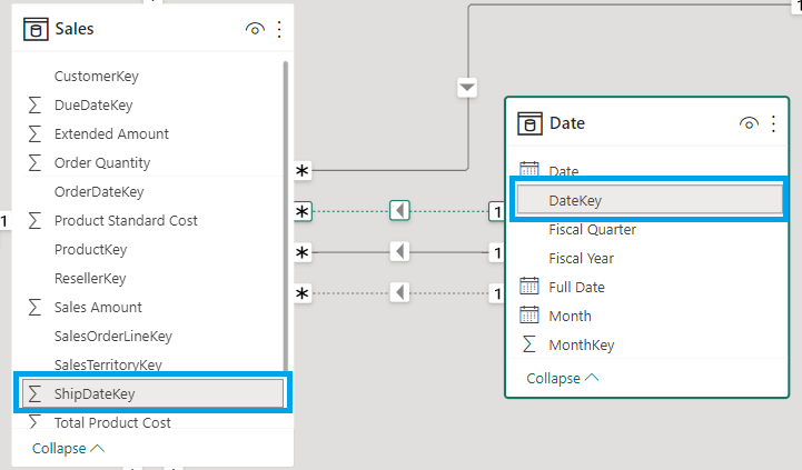
You can check the results in the Data view and Model view views. Note that based on the naming conventions, the loader immediately recognized some of the foreign key relationships.

-
Note in the model that for dates, the relationships are not recognized by the loader. Let's create them by hand. Drag and drop the OrderDateKey, ShipDateKey and DueDateKey fields from the Sales table one by one onto the DateKey column of the Date table.
Let's create the first report
-
Let's switch to Report view.
-
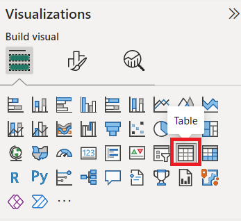
Add a new table to the current page.
-
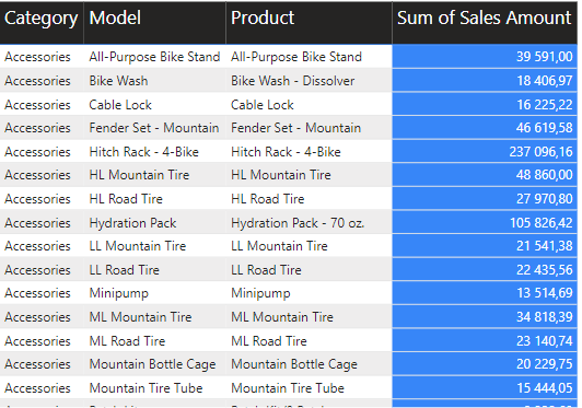
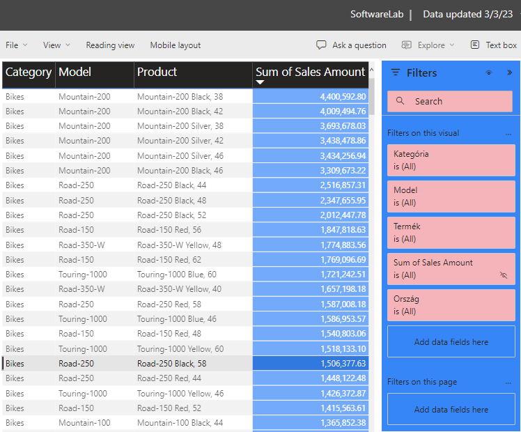
Drag the following columns from the Data toolbar onto the table:
- Product/Category,
- Product/Model
- Product/Product
- Sales/Sales Amount

-
Note that the Product and Sales tables are in a one-to-many relationships, therefore, results from the Sales table are automatically summed together.
-
Let's format the table. To do this, we use the Format your visual page of the Visualizations toolbar (make sure the table is constantly selected).
-
Choose the Alternating rows option for Style presets. This will give the table a default formatting.
-
In the Values block, set the font size to 14, and set a custom Text color and Alternate text color.
-
Resize the table so that the content fits nicely with the larger font size.
-
Increase the font size of the header (column headers)
-
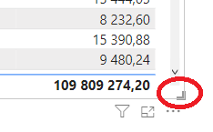
Turn off the summary (set the switch in the top right corner of Totals/Values to off)
-
Let's Highlight the amount column. To do this, select Sum of Sales Amount column in the Specific column block, set the value of Text color to white, and set Background color to a darker color.
-
At this point, our table looks something like this:
-
Creating and publishing filters
Below we define custom filters for the report and then publish our work.
-
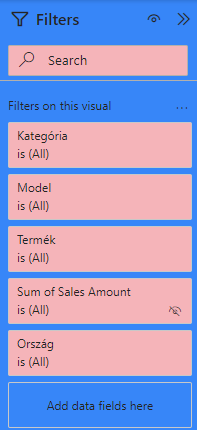
Click the filter icon below the table to bring up the Filters toolbar. You can see that filters have already been created for the 4 columns.

-
Drag the SalesTerritory/Country column to the filters section. Now we can filter by country as needed.
-
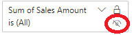
Hide the sales price filter. To do this, click the small eye icon inside the Sum of Sales Amount filter. Although the filter will still be visible to us, it will no longer appear as such in the published report.
-
Click on a section of the page where there is no table to select the page itself. The formatting in the Visualizations toolbar will then include settings for the entire page (Format page). Within this, we customize the appearance of the filters in the next steps.
-
Set the Filter pane/Search property to a different bright color.
-
Set the Filter pane/Background property to a darker color.
-
Set the Filter cards/Background property to the same color as the Filter pane/Search color. The end result could be something like this:
-
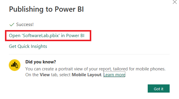
Save the changes and publish the completed report to the online service using the Publish button on the Home page.

-
When publishing, mark the default workspace as the destination (My Workspace)

-
After successful publication, click on the link in the dialog to open the report.
-
Let's experiment with our final report to see what we've done.
SUBMISSION
Take a screenshot of the published report. Save the image as f1.png and submit it with the other files of the solution. The image should show the entire screen (browser window, system tray, etc.). Check again that your Neptun code is visible (in the upper gray line)!
Also upload the updated NEPTUN.pbix file.
2. Task: Chart (5p)
This exercise is to be completed individually for 5 points.
Create chart
The tabular display shows the sales data in detail. However, a chart can be interpreted more quickly. Make a chart showing the sales volumes for each product category.
-
For this chart, create a new page in the report.
-
Let's use the opportunity to give meaningful names to the pages. Double-click the page names to rename them. Call the first page 'Table' and the new page 'Chart'
-
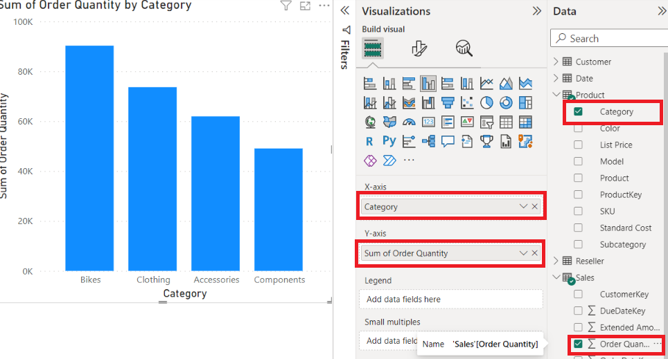
Add a clustered column chart to the new page.

-
In the chart, we want to summarize the number of sales by product category. Here's how we can achieve this.
-
Select the chart.
-
You can specify the parameters on the Visualizations toolbars Build visual page. Drag the Product/Category column onto the X axis field and the Sales/Order quantity column onto the Y axis field.
Annual breakdown
As a next step, we would like to look at the previous data in an annual breakdown. Since there are three types of dates in the Sales table (OrderDate,DueDate,ShipDate), we need to decide which one to use. For us, the order date will now be relevant, so we need to make sure that if we filter or group by Date table, the system takes this into account.
-
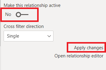
Open the Model view. Notice that there are three connections between the Sales and the Date table, but only one of them is highlighted by a continuous line, and the other two are dashed. The continuous line is the active link and will be the basis for subsequent grouping and filtering. Move the mouse cursor over each link to see which columns are connected. There can be no more than one active relationship between two tables.
-
If the OrderDateKey-DateKey connection is not the active one, we must first terminate the existing active connection. To do this, select it, and turn off the Make this relationship active option, then click Apply changes.
-
Similarly to the previous step sequence, select the line for the OrderDateKey-DateKey connection and make it active. Do not miss the Apply changes step.
Hint
There could be a situation where we want to categorize based on two types of dates at the same time. In this case, we can bypass the one-relation-one-active-connection limit by duplicating the Date table.
-
To return to the report view, drag the Date/Fiscal Year column to the Legend property of the chart.

-
Publish the report in a similar way to the previous task. In the course of publishing, we will see that our previous report with this name is already in the cloud. Feel free to select the Replace option if you are asked to overwrite it.
SUBMISSION
Take a screenshot of the published report. Save the image as f2.png and submit it with the other files of the solution. The image should show the entire screen (browser window, system tray, etc.). Check again that your Neptun code is visible (in the upper gray line)!
3. Task: Map (5p)
This exercise is to be completed individually for 5 points.
Power BI has a number of spectacular and intelligent diagram models. The following is a world map showing each country's sales by category.
- Add a new page with the name Map, add a Map on it and fill in its properties as follows

-
Location should be set to SalesTerritory/country
-
Bubble size should be set to Sales/order quantity
-
Resize the map to fill in the page
At this point, you can already see the bubbles proportional to the national sales data on the map. In the last step, we will break down the data by categories, which we can do by using in the Legend field of the bar chart.
-
Legend should be set to Product/category

-
Publish the report in a similar way to the previous task.
SUBMISSION
Take a screenshot of the published report. Save the image as f3.png and submit it with the other files of the solution. The image should show the entire screen (browser window, system tray, etc.). Check again that your Neptun code is visible (in the upper gray line)!
4. Task: Sales Reports (5p)
This exercise is to be completed individually for 5 points.
In this exercise, you will learn about complex filters, line diagrams, and complex data
Content of the report
Provide a report on how product sales for each category and subcategory have progressed year-on-year, including monthly breakdowns. Also visualize the results in a line chart.
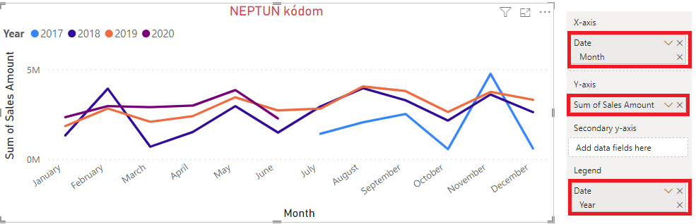
The final report should be similar to the following:

The solution steps are described below:
Slicer
-
Create a new page with the name Categories. A report similar to the sample will be achieved by using 3 different Visuals
-
Put a Slicer on the report. It will function as a filter, by displaying the filter categories on the UI.
-
Drag the Product/Category and Product/Subcategory columns on the Slicers Field property. (The order matters!). Try out the Slicer!
Table
-
Place a Table component next to the Slicer. If necessary, resize both of them so that their heights are aligned.
-
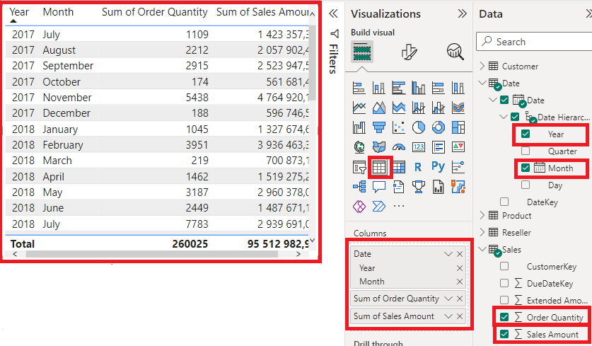
In the table, order times will be grouped by year and month. Here, we take advantage of the system's "understanding" of how dates work so that the Date/date column can be expanded and the Year and Month fields can be used separately. Let's do this.
-
Add the columns Sales/Sales Amount and Sales/Order Quantity to the table.
-
Let's try out how selecting certain categories in the Slicer affects your current data.
Line chart
-
Place a Line Chart component under the Slicer and the Table. Resize them as needed so that the width of the chart is the same as the elements above it.
-
In the chart, we will plot the monthly sales data grouped by years.
-
Set the X-Axis field of the chart. Its value should be Date/Date/Month while Y-Axis should be set to Sales/Sales amount.
-
Use the Legend field to categorize the results by year, drag and drop the Date/Date/Year column onto it.
-
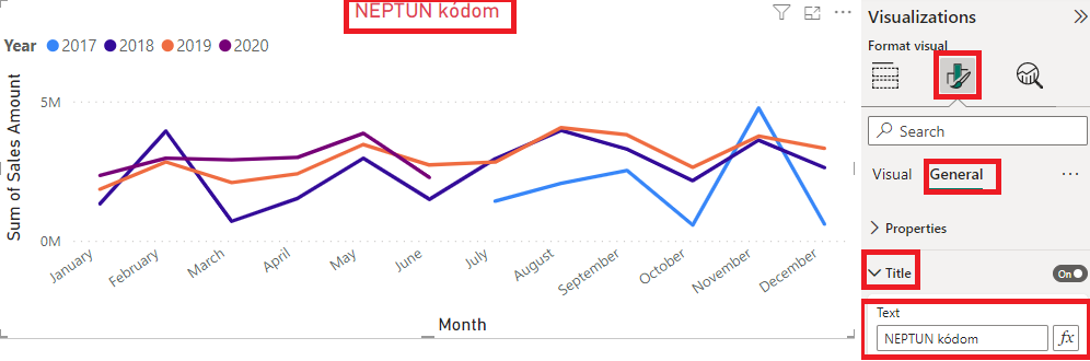
Finally, set the title of the graph. You can do this using the General tab on the Format your visual page in the Visualizations toolbar. Set the value of the Title field to your Neptun code, and in the same block, increase the font size, set the Text color field to red, and center the text (Horizontal alignment:Center)
SUBMISSION
Take a screenshot of the published report. Save the image as f4.png and submit it with the other files of the solution. The image should show the entire screen (browser window, system tray, etc.). Check again that your Neptun code is visible (in the upper gray line)!
5. Task: Optional task
You can earn 3 IMSc points by completing this task.
Create a pie chart about the number of transactions in each product category. Enter your Neptune code in the title of the diagram..
-
Colors of the categories (as shown below) should be red, yellow, green and blue
-
Data labels should be inside the pie chart
-
Upload the completed report to the online Power BI service as well!
-
The title of the chart should be your Neptun code and should be displayed centered and in bold
-
The goal is to create a similar chart to the one below

SUBMISSION
Take a screenshot of the published report. Save the image as f5.png and submit it with the other files of the solution. The image should show the entire screen (browser window, system tray, etc.). Check again that your Neptun code is visible (in the upper gray line)!